My Role
Product Designer
Tools
Figma
After Effects
Illustrator
Simplifying User Search in the E-commerce Admin Dashboard
This case study explores the redesign of a specific feature within the EcomDash admin dashboard for "ShopWell," a large e-commerce platform. The original user search functionality was cumbersome and time-consuming, hindering admins' ability to quickly locate specific user profiles. The redesign aimed to streamline the search process and enhance user management efficiency.
Problem Statement
Usability testing revealed a critical pain point. Admins found searching for users within EcomDash frustrating. The existing search bar lacked filtering options, forcing admins to sift through large user lists based on limited criteria like username or email address. This wasted valuable time and caused frustration.
Solution
To address the bottleneck, we designed a more robust user search experience within the EcomDash dashboard.
Discovering the problem
Usability testing revealed the user search pain point. Admins expressed frustration with sifting through extensive user lists based on just username or email. This highlighted the need for a more robust search experience.
User Flow
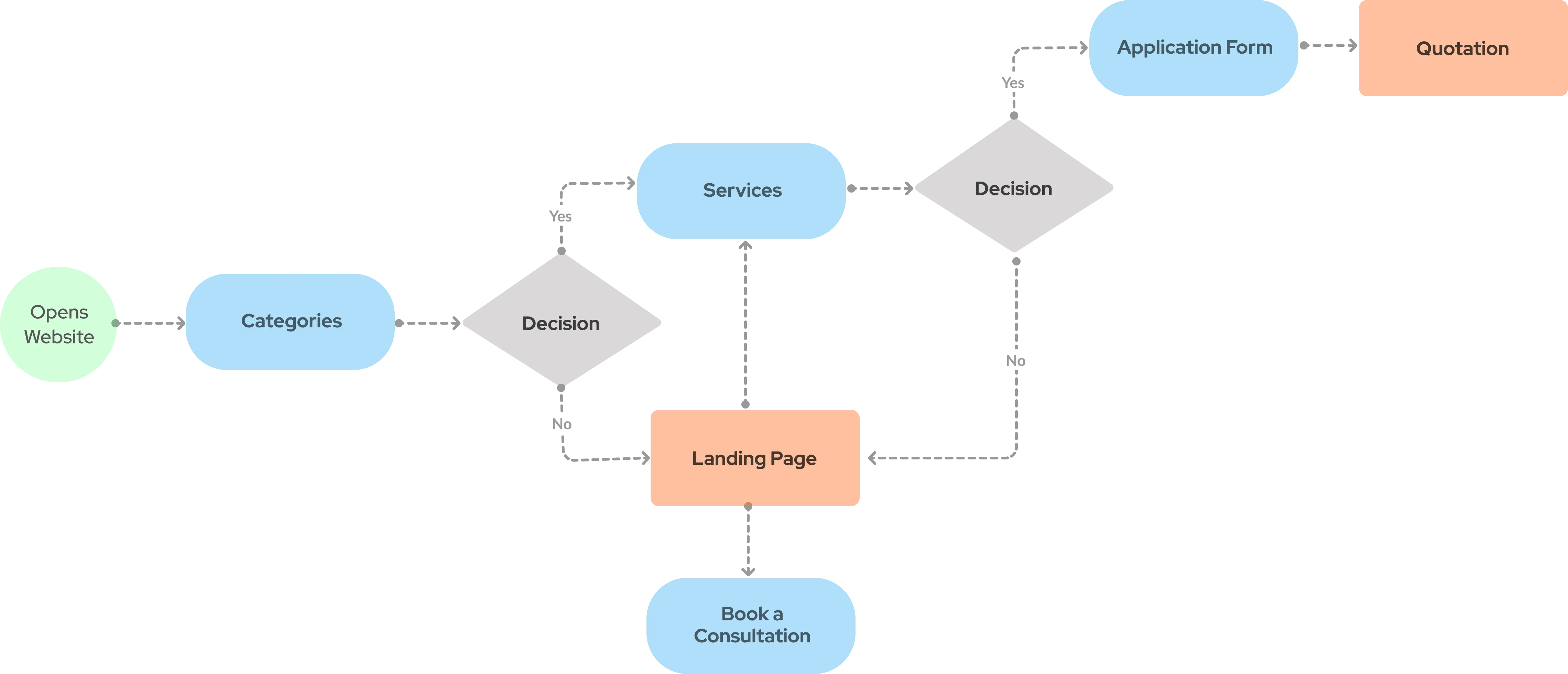
The original user flow involved admins navigating to the "Users" section, entering limited search criteria, and reviewing lengthy user lists. The redesigned flow streamlines this process with advanced filtering and auto-complete suggestions.
Sketches
Initial design explorations focused on various search bar layouts and filtering option placements. Sketches explored drop-down menus, side panel filters, and different information hierarchies for displaying search results.
Style Guide
To ensure visual consistency, a style guide was created to define UI elements like buttons, icons, and color palettes. This ensured a clean and user-friendly aesthetic for the redesigned search bar.
Colours
I received the color schemes from the business's trademark hues, coupled with a hint of congruous shades.
Typography
I selected Raleway for the site due to its smooth and flexible typeface featuring geometric letters and optimal character separation. Its variety, including numerous weight choices, makes it perfectly suitable for both headings and textual content.
Icons
I chose an uncomplicated set of icons since intricate ones amplify mental effort. My focus was on simplicity to aid users in grasping the meaning of the icon and identifying them on smaller displays.
Design Explorations
eyond the initial sketches, further design explorations delved into interactive elements like auto-complete functionality and the visual presentation of search results. Prototypes were used to test different design iterations and user interactions.
User Feedback
User feedback played a crucial role in refining the design. Admins participated in testing the prototypes, providing valuable insights into the search bar's functionality, ease of use, and overall effectiveness.
The final design incorporated the learnings from user feedback and testing. The redesigned search bar features an enhanced search field, advanced filtering options, auto-complete functionality, and a clear visual hierarchy for search results, allowing admins to locate specific user profiles quickly and efficiently.
What I Learned
The redesigned user search functionality within the EcomDash admin dashboard demonstrably improved user experience and workflow efficiency for ShopWell administrators. The new search bar empowers admins to locate specific user profiles quickly and effortlessly, ultimately contributing to improved customer service and platform operations. This case study underscores the importance of user-centered design principles in optimizing admin dashboards for enhanced functionality and user satisfaction.
Future Plans
Continuous User Experience improvement
While the initial redesign significantly improved the user experience, future iterations can be informed by ongoing user feedback and data analysis.


